

Kids are extraordinary little humans, and their environments deserve our very best attention, creativity, and care. Therefore, kids wallpaper color must look more than just pretty—because it’s a language that speaks directly to their moods, focus, and even sleep. Children, with their developing senses and emotions, are especially receptive to these subtle cues.
Designing a kid’s room is like setting up a stage for all their adventures—give them a nurturing backdrop, a bit of color-fueled inspiration, and room to grow into their brightest selves.
The Psychology of Color in Kids’ Bedrooms
Calming & Restful Colors
- Soft Blues—Consistently shown to promote calm, lower heart rate, and support better sleep. Great for walls if your child is energetic or has trouble winding down.
- Gentle Greens—Bring in a sense of nature, harmony, and balance. Green is restful for the eyes and can gently boost concentration without overstimulation.
- Lavender or Light Purples—A soothing, slightly magical touch—calming but with a little creative flair.
Cheerful & Uplifting Colors
- Warm Yellows—Think buttery or pastel, not neon. Yellow can boost happiness and optimism, but too much or too bright may cause agitation or trouble sleeping.
- Peach or Coral—Warm, soft, and nurturing. These shades can feel friendly and inviting, great for play areas or accent walls.
Creative & Imaginative Colors
- Pale Oranges or Muted Teals—Oranges (in moderation) can spark enthusiasm and creativity, while teal combines blue’s calm with just a hint of energy.
- Accent Colors—Splashes of vibrant color (a sunny mural, a bold rug) inspire play and curiosity without overwhelming the senses.
Neutrals & Nudes—The Subtle Canvas
Off-Whites, Taupes, Light Greys—These wallpaper colors create a sense of spaciousness and calm, letting toys, art, and textiles bring in color and personality. But if it’s too bland, the room might feel uninspiring—add color pops for balance!
The 60-30-10 Rule: The Golden Ratio of Room Color
A single color can feel flat, but too many can tip into chaos—the magic was always in the balance. This rule is a designer’s best friend, easy enough for anyone to apply but powerful enough to make a room sing.
- 60% – Dominant Color
This is your “background”—usually walls, maybe a big rug or bedding. Choose a calming, neutral, or soft hue here (think soft blue, gentle green, light taupe). It sets the mood and leaves space for other colors to breathe.
- 30% – Secondary Color
Use this on curtains, furniture, or one feature wall. This one should relate to your main hue, either as an analogous color for calm (like green with blue), or as a softer complement for subtle energy (like soft coral with gentle teal).
- 10% – Accent Color
Here’s your “cherry on top”—artwork, lamps, pillows, playful patterns. Go bolder, but still keep it friendly. This is where you can bring in a pop that excites the senses (sunny yellow, coral, sky blue, even a dash of cheerful orange).
Palette Harmony: Calm vs. Dynamic
Analogous Colors
(e.g., blue + green + teal)
Super smooth, tranquil, and harmonious. Great for restful, zen-like bedrooms or sensitive kids who need help winding down.
Complementary Colors
(e.g., blue + orange, purple + yellow)
These bring energy and visual “bounce.” For kids’ rooms, use them in softer, less saturated shades—a pastel blue wall with apricot accents, for example. Too much of both can be overwhelming, but little pops (think an orange pillow on a blue chair) are cheerful and lively!
Triadic or Split-Complementary
Three colors spaced evenly on the color wheel (e.g., blue + yellow + red). Use one as the star, the others as accents. This can bring fun and vibrancy without the room feeling too wild and even unsafe.
Too much plain means boredom, but a color circus is no fun either. The sweet spot is a comforting base, a harmonious friend, and a joyful surprise. Like a good bedtime story: calm beginning, interesting middle, and a fun twist at the end!
Remember, you can always update accents as kids grow—swap out a yellow lamp for a green one, or add new art as interests change. The foundation will keep things grounded.
Colors Best Avoided (and Why)
Very Dark Colors (Deep Charcoal, Navy, Black)
While these can feel dramatic and cozy in small doses, on large surfaces they risk making a space feel heavy, closed-in, or even a little gloomy—especially for young children who need openness and light for their imaginations to soar without unnecessary emotional pressure.
Some studies link dark rooms with lower mood and even increased anxiety, especially if there’s not much natural light to balance things out.
Intense Reds or Neons
Bright, aggressive reds or eye-popping neons (green, yellow, pink) are highly stimulating. For sensitive kids, they can trigger restlessness, agitation, or even trouble sleeping. And, red wallpaper color is linked to increased heart rate and excitement—not always what you want at bedtime!
Color Combinations to Skip
- Clashing Contrasts: Think red + lime green, purple + yellow, or too many bold primaries together. These can cause visual chaos, making it hard for a child to relax or focus.
- Overly Cool & Stark Palettes: All-grey or all-white, if used without warmth or pops of color, can feel cold, lonely, or sterile—far from the cozy vibe you want for a child’s sanctuary.
Murky or “Dirty” Colors
Very muddy browns, olive greens, or dull yellows can feel uninspiring or drab, and may not spark the joy and creativity you’re hoping to nurture.
If a certain color or combo just “feels off,” trust that instinct! Kids are wonderfully perceptive and will thrive in a space that feels both joyful and secure.
Pigment Safety: The Practical Side
Most modern paints and wallpapers are much safer than decades ago, but here’s what to keep in mind:
- Low-VOC or Zero-VOC Paints
VOCs (volatile organic compounds) are chemicals that can off-gas from paint and wallpaper glue. Best to choose low- or zero-VOC options, especially for kids’ rooms.
- Check for Certifications
Look for products labeled “GreenGuard Gold” or similar, which are independently tested for chemical safety. These you can trust.
- Wallpaper Inks
Most reputable brands use non-toxic, water-based inks now, but always check the label—especially if you’re shopping online or considering imported brands from China.
- Old Paints or Wallcoverings
If your home is older, be cautious of existing paint layers. Lead-based paint (used before the late 1970s) is a real health hazard for children.
- Proper Ventilation
After any redecorating, air out the room thoroughly before your child moves back in.
Tips from the Pros
- Balance is Everything
Too much bright color can overstimulate; too much neutral might feel sterile. Combine calming backgrounds with playful accents. Go for softer, lighter versions of your chosen colors—kids process color more intensely than adults, so what seems subtle to you might feel super-charged to them.
And, better to avoid anything that could be perceived as “scary” or too abstract—kids’ imaginations are powerful!
- Natural Light Matters
Colors look different in sunlight vs. artificial light—test a few swatches at different times of day. Paint big swatches of the color combinations and check them morning, noon, and night—bedroom change with the sun, and so do colors!
- Zones for Mood
Use color to “zone” the room—maybe a calm reading nook in green, and a more energetic play space with pops of yellow or orange.
- Patterns and Texture
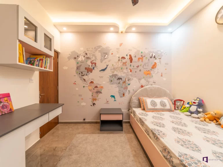
Try to add stripes, polka dots, clouds, or stars in your palette colors. This keeps things visually interesting and playful without adding more colors. But you need to keep in mind that even with great colors, overly busy wallpaper can overwhelm a little one’s senses.
- Involve Your Child
Let them pick from a curated palette—it gives them agency and lets you steer clear of colors that might be overwhelming. And, this practice makes the room feel truly theirs.
The first thing kids see when they wake up sets the tone. A thoughtfully chosen wallpaper color palette can gently nudge them toward curiosity, comfort, or creativity (and maybe even more peaceful sleep for everyone!).
Think of the bedroom as a stage for your child’s growth—a calming backdrop with playful highlights, tuned to their temperament and your family’s rhythm. Your parent’s touch must be all about balance, intention, and a little bit of magic—because the best spaces grow with your child, so let the design be flexible enough to evolve as their tastes and needs change.