
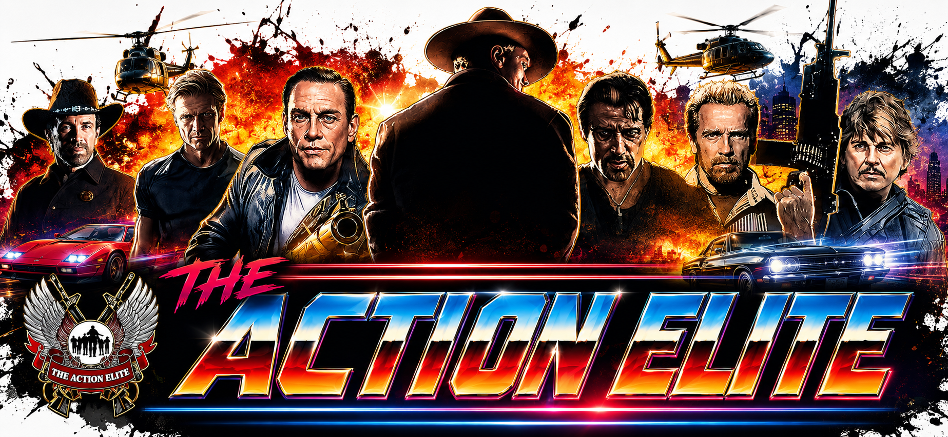


Action films use typography to communicate danger, speed, confidence, and mystery before the first scene even begins. The same visual approach can give a social profile more personality and character—without making it difficult to read.
An action movie does not wait for the first car chase to tell you what kind of world you have entered. Often, the title card has already done the job. Heavy lettering suggests force. Narrow type feels fast. A worn, industrial look hints that things are about to get rough. Clean geometric letters can make a story feel controlled, technical and futuristic.
A TikTok profile works with much less space, but the challenge is similar. A visitor sees a profile photo, a name and a short bio. That is not much room to establish a personality. Default text is perfectly functional. It is also easy to overlook when every profile uses it in exactly the same way.
The answer is not to make every character louder. It is to borrow the visual discipline of a good movie poster: choose one mood, use it consistently and know when to stop.
What action-movie typography actually does
There is no single action-movie font. A military thriller, a superhero blockbuster and a quiet spy film may all use very different lettering. What they share is intent. The type supports the identity of the story.
A bold, compact style can make a stunt channel feel energetic. Monospaced text suits an account built around gadgets, editing or tactical games. Wider lettering feels futuristic. Small caps can create the calm, coded mood of a spy file. The choice should come from the content, not from whichever option looks most unusual in a generator.
That distinction matters. Decorative text can add a strong first impression, but it cannot create a personality that the videos do not support. Think of it as the title sequence, not the whole film.
These are styled characters, not downloadable fonts
Most so-called TikTok fonts are Unicode characters that resemble bold, script, monospaced or other styled lettering. They are copied as text, so they can be pasted into many profile fields without installing a font file or turning the words into an image.
A browser-based tool such as Fontalic lets you compare those styles quickly. The useful part is not the number of choices. It is being able to see the same name in several treatments and reject the ones that become difficult to read.
Test before you save
Support varies between devices and apps. An unusual character may appear correctly on one phone and as an empty box on another. That is why a final mobile check matters more than how the text looks inside the generator.
Username, display name and bio are not the same thing
TikTok separates the account username from the visible nickname or display name. The username is the handle that begins with @. It follows stricter character rules and is not the best place for decorative Unicode text. Keep it simple, searchable and easy to type.
The display name offers more room for style. TikTok currently allows a nickname of up to 30 characters, although shorter usually works better on a phone. A bio can also carry a styled word or short phrase, but the practical information should remain clear.
A clean setup might use an ordinary @username, one styled display name and a mostly plain bio. That gives you a visible identity without making the account hard to find or understand.
Five cinematic directions worth trying
| Direction | How it feels | Best fit |
| Modern blockbuster | Heavy, direct, confident | Stunts, fitness, edits |
| Tactical file | Measured, coded, technical | Gaming, gear, breakdowns |
| Futuristic agent | Wide, polished, controlled | Tech, VFX, sci-fi |
| Gritty antihero | Rough-edged, intense, rebellious | Reviews, cosplay, music |
| Minimal spy thriller | Quiet, precise, mysterious | Film analysis, storytelling |
-
Modern blockbuster
Use strong, compact lettering and keep the name short. This direction works when the content has movement: fight choreography, training clips, car edits or fast-cut entertainment. A name such as CUT SCENE or NIGHT SHIFT carries more weight than a long slogan.
-
Tactical file
Monospaced or squared-off characters can suggest mission logs, equipment labels and on-screen briefing graphics. The effect is strongest when it remains controlled. One divider, number or short code is enough. MISSION / 07 feels intentional. A row of random symbols does not.
-
Futuristic agent
Wide lettering and clean spacing create a sleek science-fiction mood. This suits visual-effects artists, technology reviewers and creators who build polished cinematic edits. It needs breathing room, so use fewer words rather than shrinking everything to fit.
-
Gritty antihero
A darker or more angular treatment can fit horror-action, revenge stories, metal music and rugged cosplay. This is where restraint matters most. If every letter is decorated, distorted and surrounded by symbols, the name stops looking tough and starts looking broken.
-
Minimal spy thriller
Not every action identity needs to shout. Small caps, simple spacing and a single code-like detail can feel more confident than oversized decoration. This works especially well for film analysis, storytelling channels and creators who prefer an understated profile.
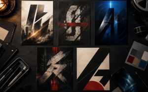
Five visual directions can share the same action-film DNA while expressing distinctly different personalities.
How to build the look without overdoing it
Start with the role you want to play
Before changing the text, describe the account in three words. Fast, technical and focused. Dark, funny and chaotic. Clean, cinematic and thoughtful. Those words are more useful than starting with a list of fonts because they give you a reason to accept one style and reject another.
Keep the display name short
Action titles are usually built around a few strong words. The same rule helps on a profile. Short names are easier to scan, survive small screens and leave room for spacing. If the full brand name is long, style only the most distinctive word.
Compare styles in context
If you want to try several treatments, Fontalic’s TikTok font generator lets you enter the same name once and compare copy-and-paste variations. Choose two or three finalists, then place them on the actual profile. The winner is the one that still reads clearly at normal mobile size.
Change one element at a time
A styled display name may be enough. If you also change the bio, keep the second treatment quieter. Good movie posters create hierarchy: a title leads, supporting information follows. When every line competes for attention, nothing feels important.
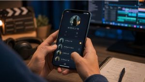
The final test belongs on a real phone, where character, support, spacing and readability become obvious.
Test the profile like a stranger would
Open the page on another phone if possible. Can you read the name in one glance? Does the bio still explain what the account offers? Would you know how to type or remember the handle? If the answer is no, simplify it.
Three before-and-after ideas
These examples show the thinking rather than prescribing one exact character style.
The action editor Before: Alex video edits After: CUT SCENE
Bio: Fast edits. Hard landings. New clips Friday.
The new version has a clear role, a short display name and a plain-language promise.
The film reviewer Before: Maya reviews movies After: CASE FILE: MAYA
Bio: Action movies, honest scores, zero filler.
The case-file idea suits the genre without borrowing the identity of a specific franchise.
The stunt trainer Before: Alex Stunts Official After: MISSION: MOVE
Bio: Safe progressions for falls, rolls and screen combat.
The title carries energy, while the bio stays direct and responsible.
The quickest ways to ruin the effect
- Decorating every word. Keep dates, contact details and calls to action in plain text.
- Forgetting the @username. A stylish display name cannot rescue a handle that is difficult to type or remember.
- Choosing novelty over clarity. If a friend has to ask what the name says, the effect has failed.
- Copying a famous movie identity. Borrow the visual principles, not a franchise title, logo or trademarked character.
- Skipping device checks. Unicode support and spacing can differ between phones, apps and operating systems.
- Ignoring accessibility. Some screen readers may announce decorative characters awkwardly or one by one. Keep essential meaning in ordinary text.
Quick answers
Are TikTok fonts real fonts?
Usually not. Copy-and-paste font tools replace ordinary letters with Unicode characters that resemble different styles. They remain text rather than installed typefaces.
Can styled text be used in a TikTok username?
The @username follows stricter character rules, so decorative Unicode is better suited to the visible nickname or selected parts of the bio. Keep the handle plain and searchable.
Why do some letters appear as boxes?
That usually means the device or app font does not contain a glyph for the selected character. Try a simpler style and test it again.
Will a cinematic name increase engagement?
There is no automatic boost. A clearer visual identity may help a profile feel more considered, but people still follow for the videos, ideas and personality behind it.
The best blockbuster move is restraint
The lesson from action-movie typography is not that bigger is always better. It is that every visual choice should support a clear identity. A well-chosen style can make a display name feel faster, tougher, stranger or more cinematic. Too many effects simply create noise.
Pick one mood. Use one strong treatment. Keep the important information readable. That is enough to move a profile from default to deliberate – and from a boring bio to something with a little blockbuster confidence.