

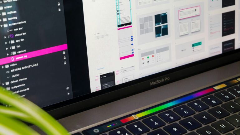
Modern digital products have great potential. They offer advanced tools, powerful features, and endless customization options. But as they expand, they often become cluttered and confusing.
What begins as a simple, intuitive product can quickly turn into a maze of menus, icons, and options that overwhelm users.
For UX and product designers, this remains a challenge: streamlining complex interfaces without losing functionality or identity. How can you make a powerful tool feel easy to use?
The answer lies in designing for clarity. With the expert guidance of Alpha Efficiency, this article guides you through everything you need to know to improve your page clarity and the UX experience.
1. Complexity Is Not the Enemy
Not all complexity is bad. In fact, many great products are complex because they solve big problems.
Tools like analytics dashboards, CRMs, or SaaS platforms naturally have many layers of features. The issue appears when users feel lost or unsure about what to do next.
The problem isn’t complexity itself. It’s confusion.
Good design structures complexity intuitively, guiding users clearly even in systems full of features. It aims to simplify access without removing depth.
Clarity transforms a complicated tool into one that feels easy, even if it’s doing a lot behind the scenes.
2. The Art of Visual Hierarchy
Visual hierarchy is the foundation of clarity. It helps users immediately understand what counts most and what can wait.
When hierarchy is missing, users have to stop and think, which breaks the flow.
Start with the goal
Before rearranging anything, identify the primary purpose. Ask:
- What is the user trying to do here?
- What information supports that action?
- What can be secondary or hidden until needed?
When the goal is clear, the design can guide attention toward it.
Lead the eye
Use scale, spacing, and color to create a sense of natural order. Larger text, stronger contrast, or more space around a button can help users understand what to do first.
Users don’t read every part of an interface. They scan. The visual hierarchy’s job is to guide that scan toward the most critical actions.
Group related elements
When similar items are grouped, the brain processes them faster. Use cards, boxes, or visual sections to organize related features.
White space also matters here. It gives breathing room and makes the structure easier to understand.
3. The Weight of Too Many Choices
Having too many options might seem like a good thing, but it usually leads to hesitation.
Psychologist Barry Schwartz named this the Paradox of Choice: when people face too many options, they struggle to decide and feel less satisfied with their choice.
In UX, this happens when users face crowded menus, endless filters, or long lists of icons. Every extra choice adds a bit of cognitive load. The result is slower decision-making and fatigue.
The solution is not to remove essential features, but to reduce visible complexity.
One helpful technique is progressive disclosure, which means showing only the most relevant actions first. Advanced tools stay available, but hidden until the user needs them.
This approach makes the interface welcoming for beginners while still powerful for experienced users.
4. Lessons from Successful Simplifications
Some of the most popular digital products have already demonstrated the power of simplification.
Apple’s Logic Pro Redesign
Apple redesigned its professional music software to look and feel closer to GarageBand, a simpler app for beginners.
By minimizing toolbars and hiding advanced settings, Apple made Logic Pro easier to explore without removing its professional capabilities.
Google Analytics 4
Google Analytics used to feel overwhelming. The new version focuses on context-driven navigation, showing data that fits each user’s goals.
Instead of more tabs and charts, it provides a more innovative organization, making insights easier to find.
Shopify’s Merchant Dashboard
Shopify refined its dashboard by grouping tasks and simplifying its color and icon scheme. Everyday actions like adding products or checking orders became more intuitive.
Merchants now spend less time searching and more time managing their business.
Each of these examples proves that simplification doesn’t mean cutting power. It means curating focus.
5. Tools and Methods for Testing Clarity
Designing for clarity doesn’t rely on guesswork. There are reliable UX tools that help test and measure how understandable an interface really is.
Card Sorting
Ask users to organize items or features into categories that make sense to them. This helps reveal how people naturally think about your content and informs how you should structure menus or dashboards.
Heatmaps
Heatmaps and click-tracking tools, such as Hotjar or Crazy Egg, show where users click or hover most often. If key actions are ignored or secondary links attract too much attention, your layout may need adjustment.
Usability Testing
Watching real users interact with your interface provides invaluable insight. Pay attention to where they hesitate or struggle to find their way. Every pause signals a moment of friction that can be simplified.
Cognitive Load Analysis
Ask yourself how many things a user must remember or compare on a single screen. Reducing mental effort, even slightly, leads to smoother, faster interactions.
6. Keeping Brand Identity While Simplifying
Some teams worry that simplifying their interface will make it look too plain or generic. But simplicity doesn’t erase personality. It actually makes a brand feel more confident and trustworthy.
Think of Spotify’s dark, immersive interface, Notion’s clean workspace, or Airbnb’s soft, inviting palette.
Each design feels calm and clear, yet still distinctive. Their simplicity highlights brand emotion rather than hiding it.
Consistency is key. When typography, color, and layout all reflect the same tone, users experience clarity and personality simultaneously.
7. The Real Value of Clarity
Clarity builds trust. When users understand what to do instantly, they feel competent and in control. When they get confused, even powerful products start to feel broken.
The most advanced systems often appear simple because designers worked hard to hide the complexity behind a clean structure.
Clarity is not the opposite of depth. It’s what makes depth approachable.
Design Less, Achieve More
Simplifying complex interfaces is not about removing features. It’s about creating focus and flow.
When design feels intuitive, users stop thinking about how to use the product and start achieving what they came for.
Every element, every button, every word should have a purpose. When every element of a design supports understanding, users feel confident, capable, and connected to the product.
In the end, simplicity isn’t about doing less.
It’s about helping users do more, with ease.